For my personal annual report, I highlighted meaningful experiences and growth through a visually driven approach, using imagery as the primary storytelling element. Inspired by a photobooth-style monochrome effect, I applied distinct color filters to each spread and paired them with data-driven highlights to emphasize key milestones.
VIEW FLIPBOOK
I designed a film-themed gala invitation that combines classic Hollywood references with a refined, playful aesthetic through a red, gold, and cream palette. The gatefold format mimics theater curtains, revealing structured event details and supporting the fundraiser’s purpose.
VIEW PDF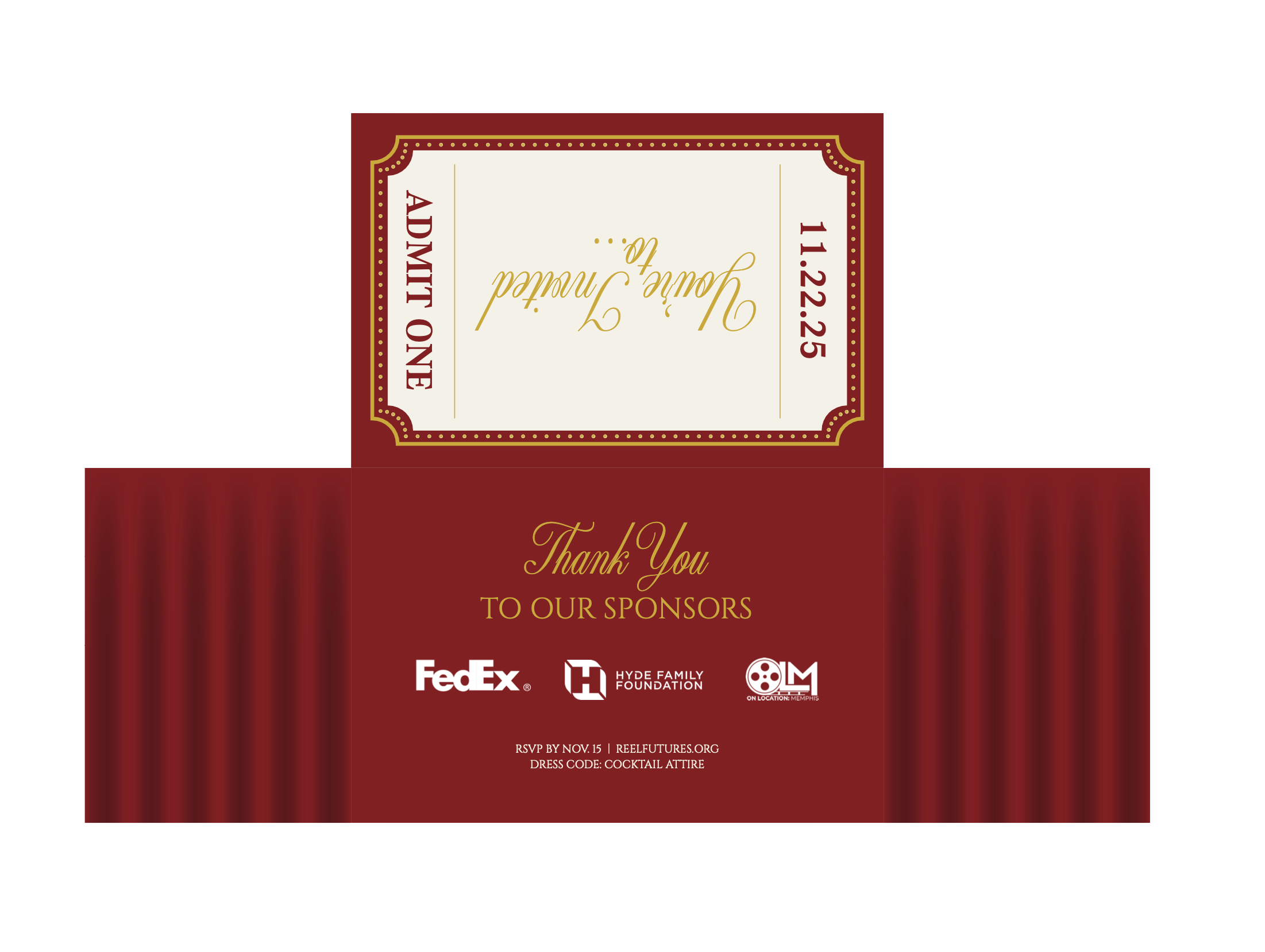
I designed a dynamic layout by dispersing the headline across the top with varied typographic weights and incorporating imagery of iconic jazz artists. A red, black, and white palette creates cohesion, while a mustard yellow pull quote introduces contrast and emphasis.
VIEW PDF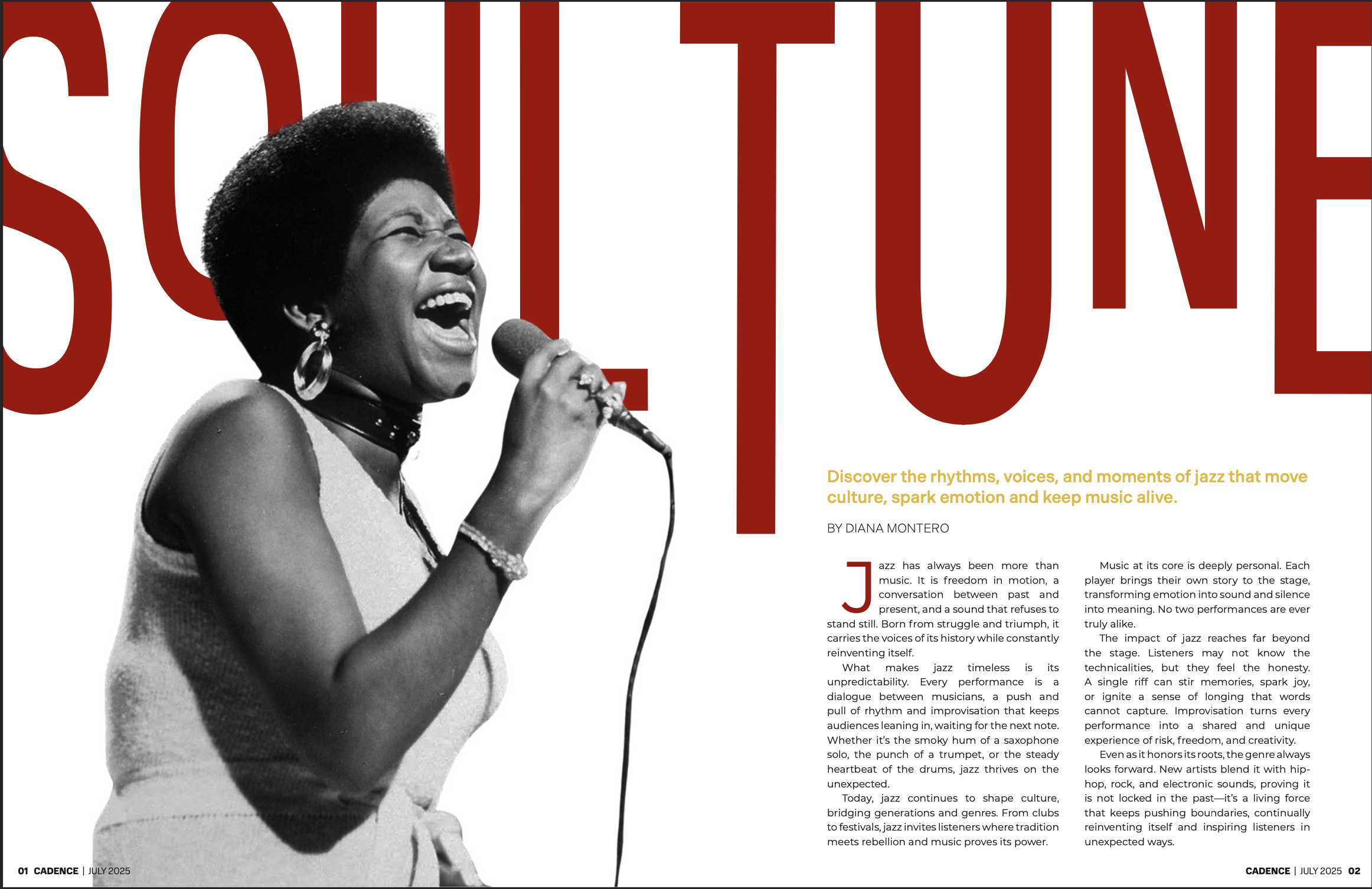
I established the car as the primary focal point, supported by bold typography, textured elements, and a mountain backdrop to evoke an outdoors-driven aesthetic. Interior imagery adds depth and reinforces the adventurous theme.
VIEW PDF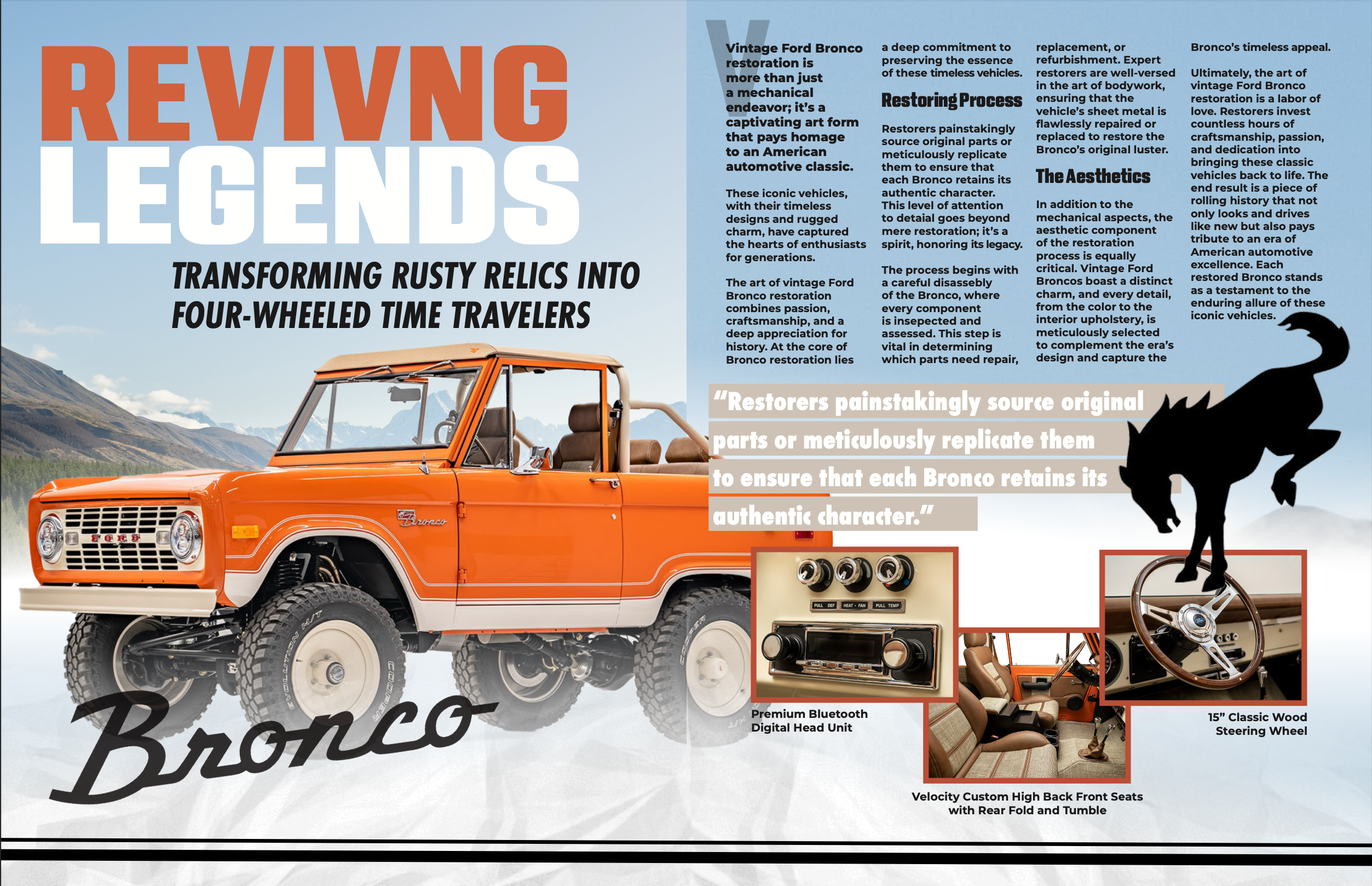
I applied a tennis-inspired color palette and structured image placement to maintain visual consistency and organization. Supporting tennis-related advertisements reinforce the theme and unify the overall design.
VIEW PDF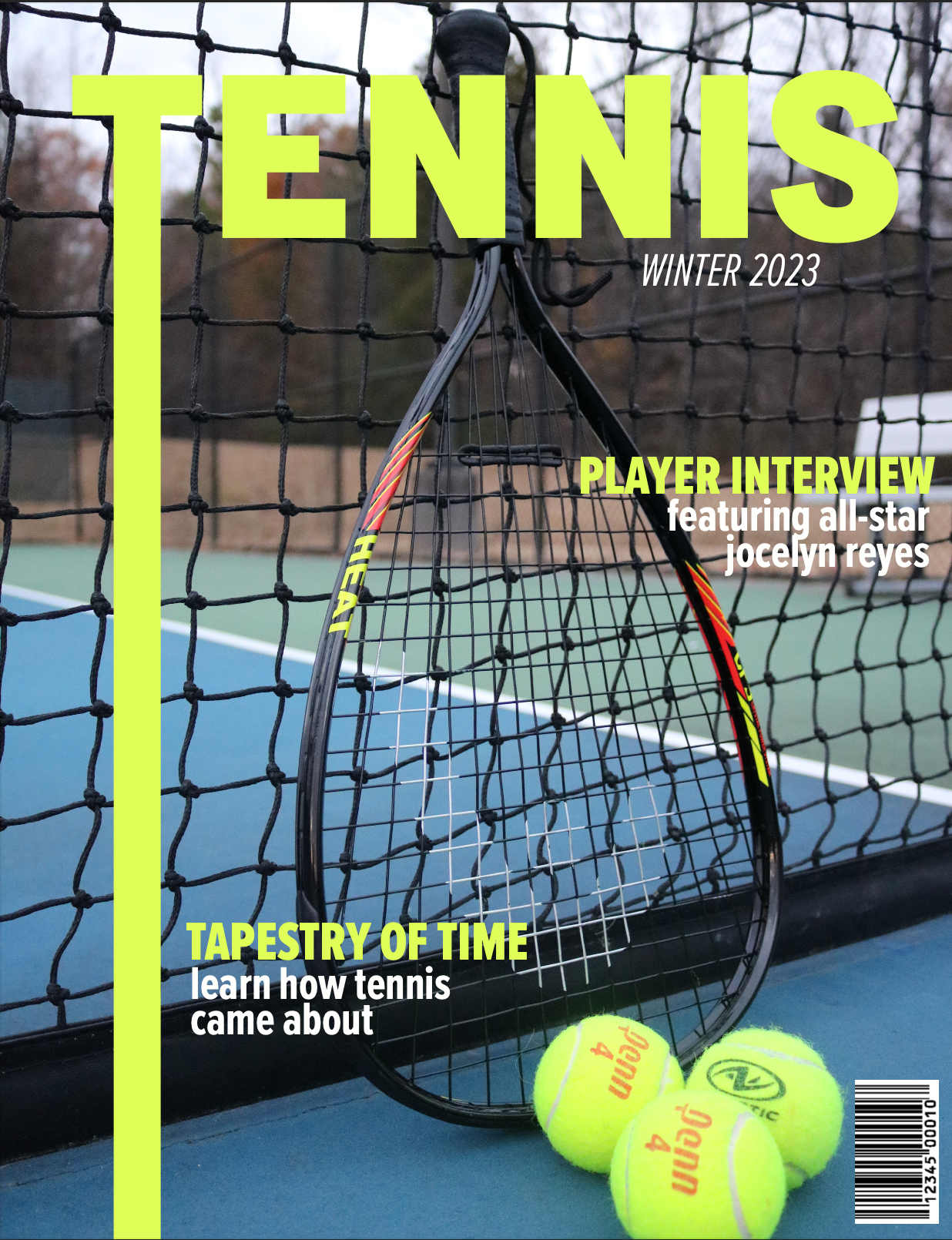
I captured the film’s whimsical tone through an alternating color background that directs focus toward the title and the illustrated figure of Willy Wonka. This approach emphasizes the central character while enhancing visual interest and hierarchy.
VIEW PDF
I applied a clean, minimalist approach, using maroon and gold to emphasize headers and specialty items while maintaining readability. Repeated patterns and the back logo create a cohesive connection between both sides of the design.
VIEW PDF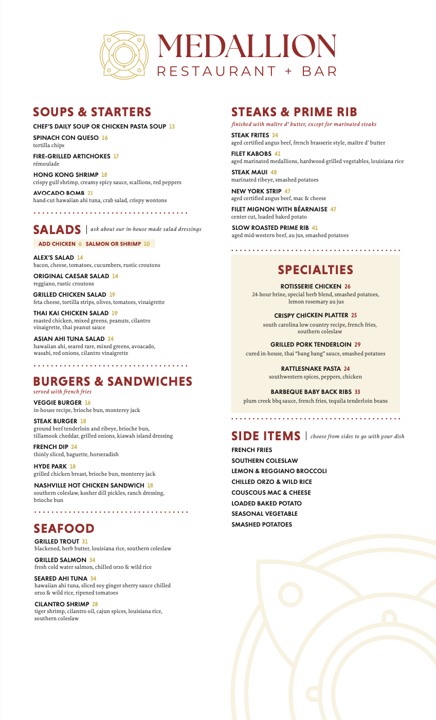
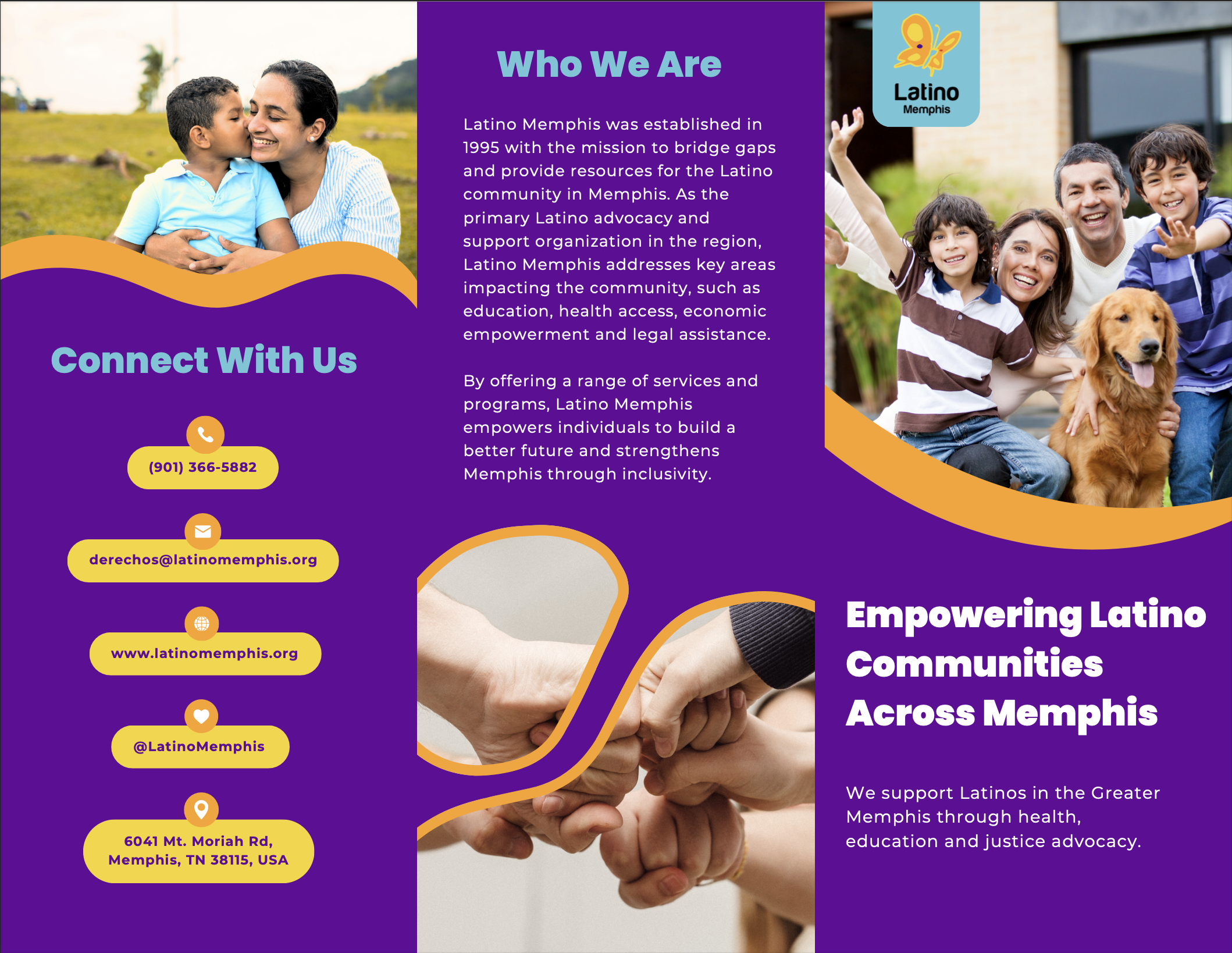
I applied brand-aligned colors and imagery to convey themes of unity, empathy, and community support, reinforcing the organization’s mission. A Spanish version would expand accessibility and better engage the Latino community.
VIEW PDF