
A branding and digital design project created to establish a cohesive and professional identity across the company’s digital presence and physical brand materials.
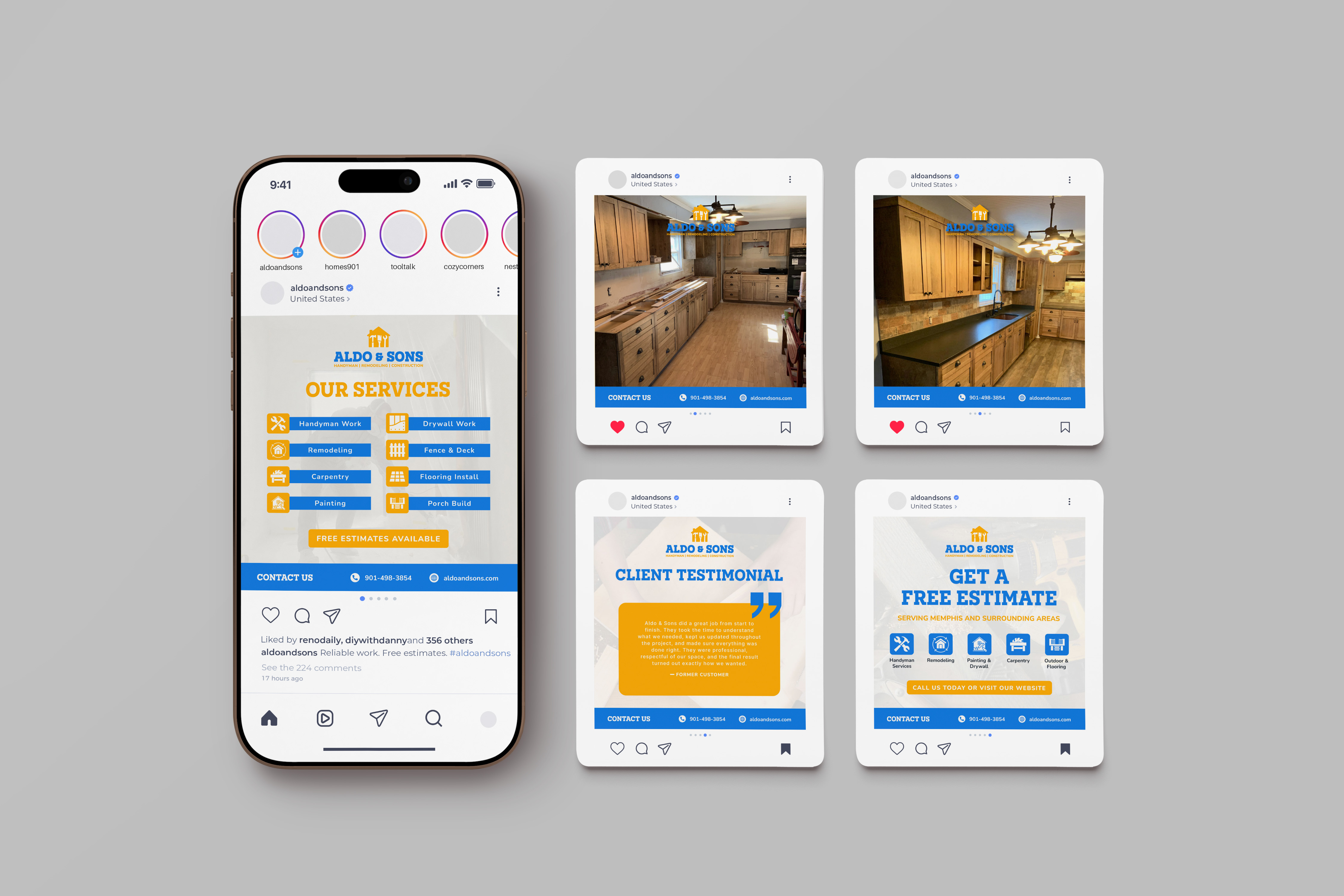
This branding and website design project for Aldo & Sons focused on creating a professional and cohesive identity across the company’s digital presence and physical brand materials. The project included a visual identity system, responsive website, social media graphics, branded workwear, and print materials such as business cards.
The goal was to help transform a referral-based handyman and remodeling business into a more established and trustworthy brand that could better showcase its work and attract new clients online.
The challenge was creating a brand that felt professional and trustworthy while still maintaining the approachable and local feel that makes the company successful through referrals. Many handyman businesses in the Memphis area rely on outdated branding or limited online presence, making it difficult for customers to quickly understand services or build trust.
Another key challenge was designing a flexible identity system that could work consistently across web, social media, apparel, and print applications.
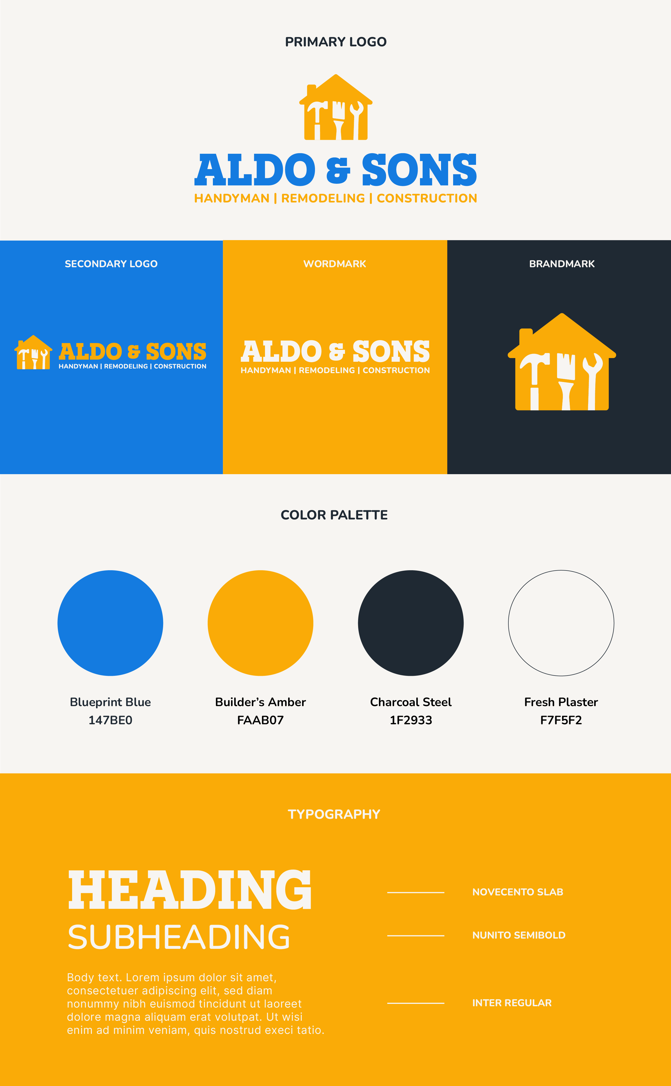
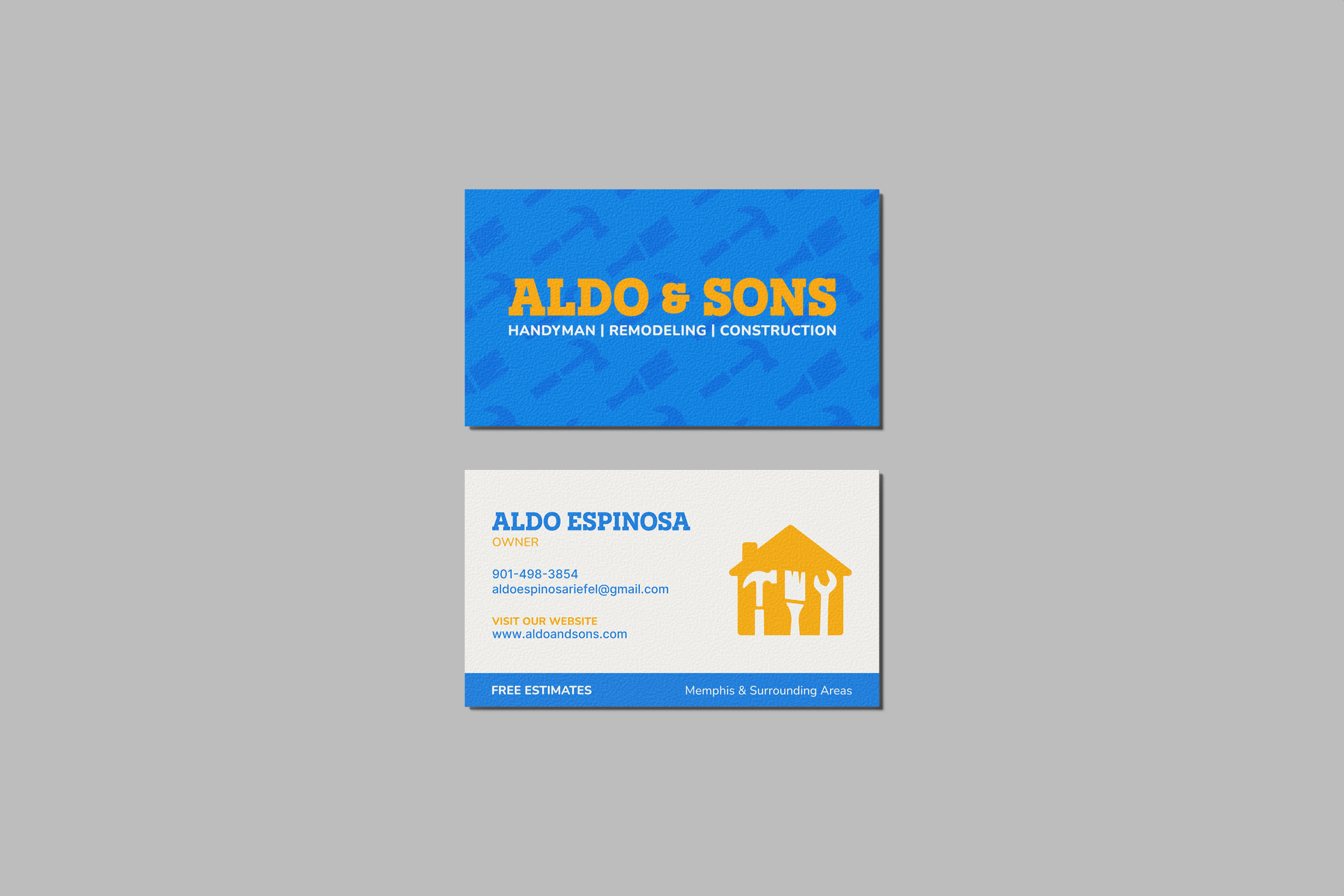
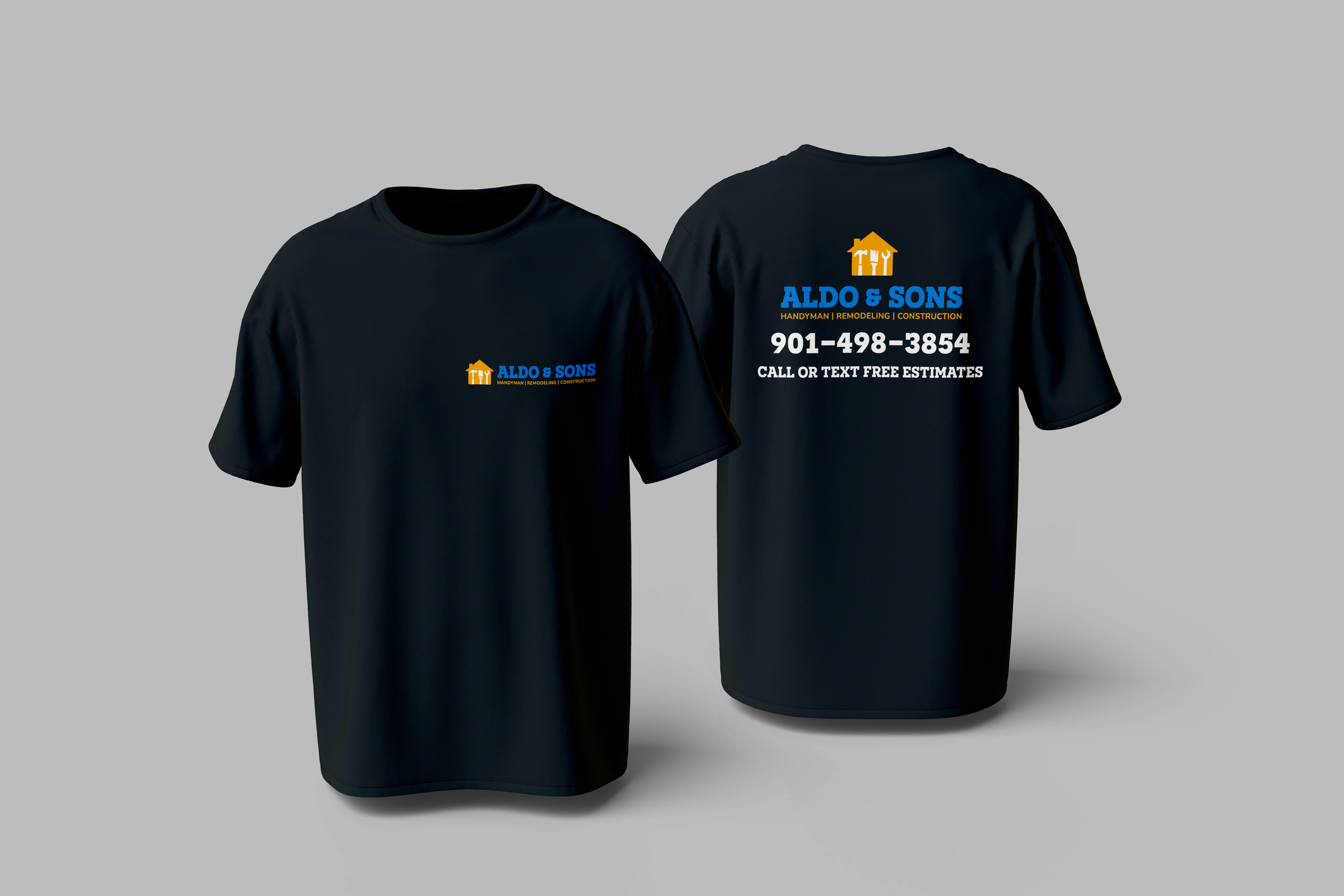
The visual identity combines bold typography, strong color contrast, and construction-inspired visuals to create a brand that feels dependable and recognizable. The logo system uses a house-shaped icon built from tools to visually connect the brand to handyman and remodeling services.
The color palette balances trust, energy, and professionalism through the use of Blueprint Blue, Builder’s Amber, Charcoal Steel, and Fresh Plaster. Typography pairs Novecento Slab with Nunito and Inter to create strong hierarchy while maintaining readability across both print and digital applications.
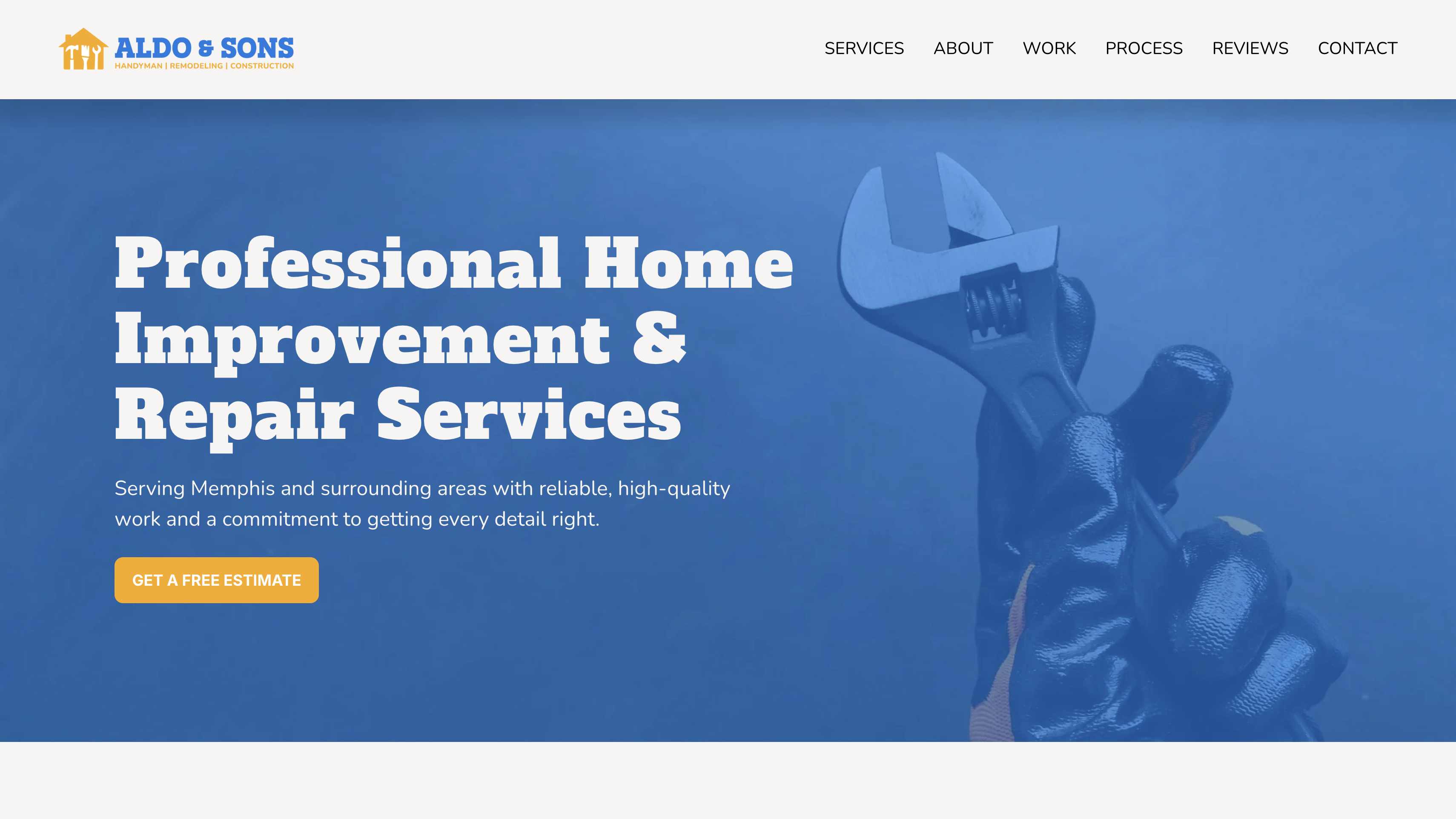
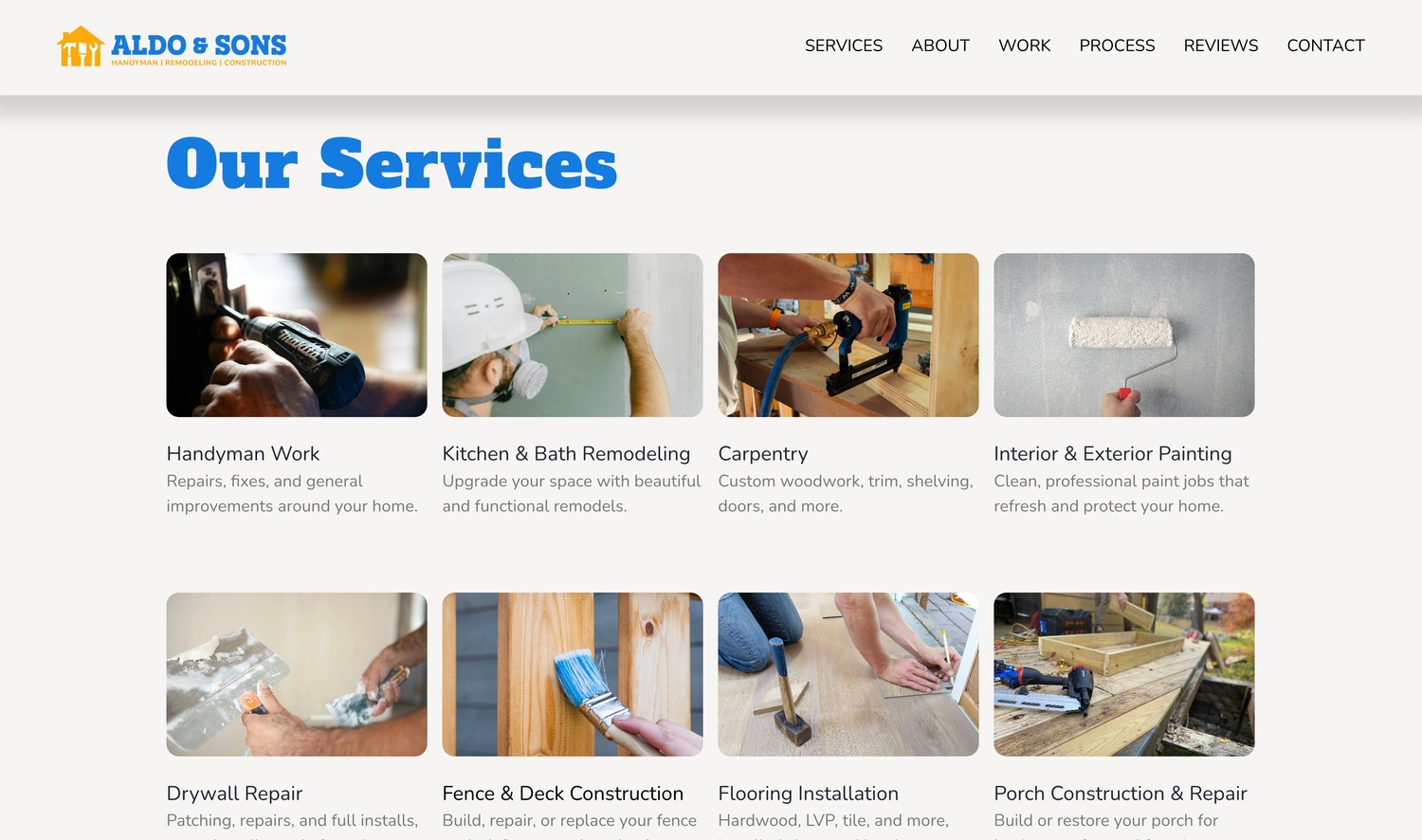
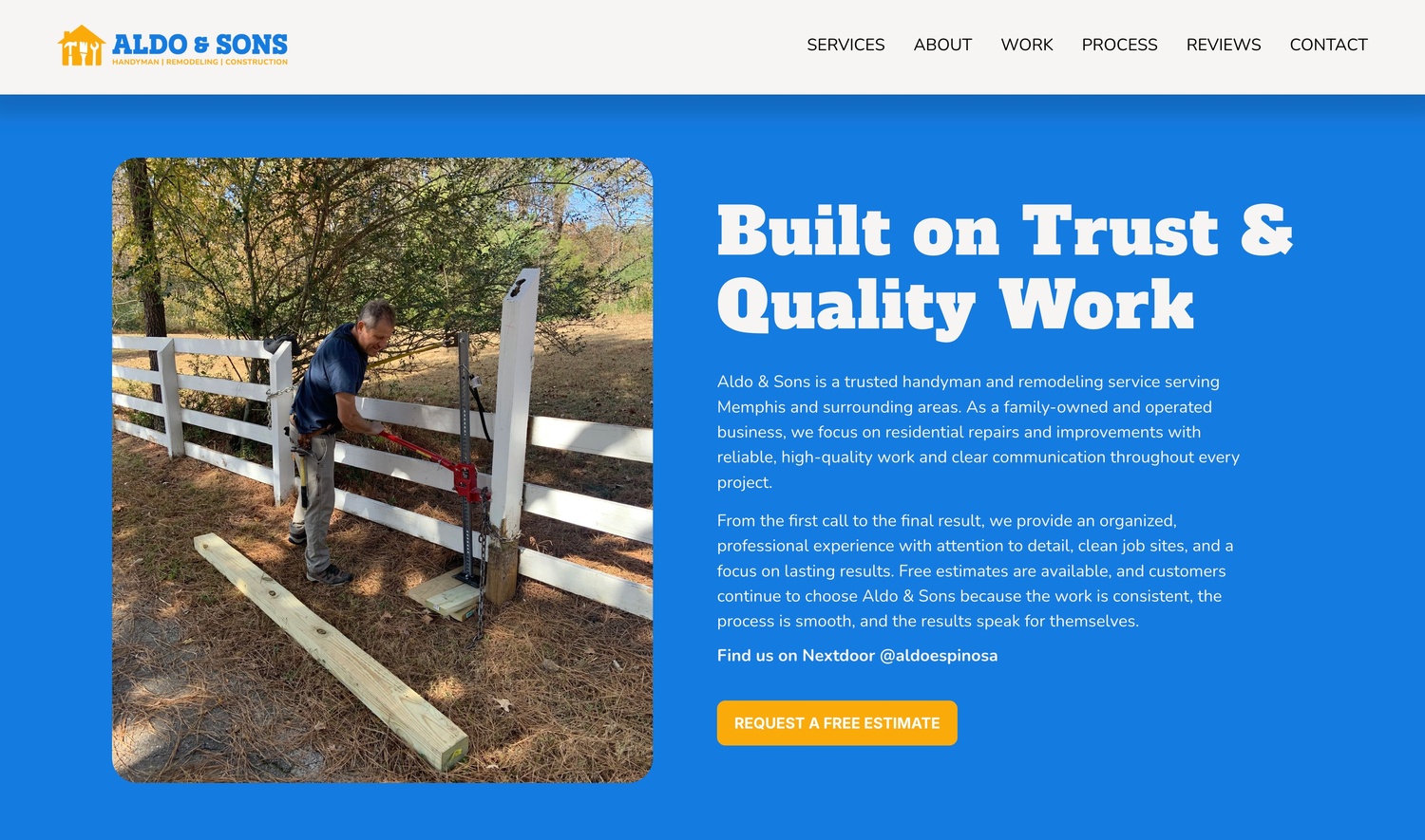
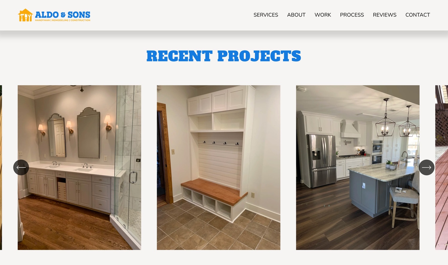
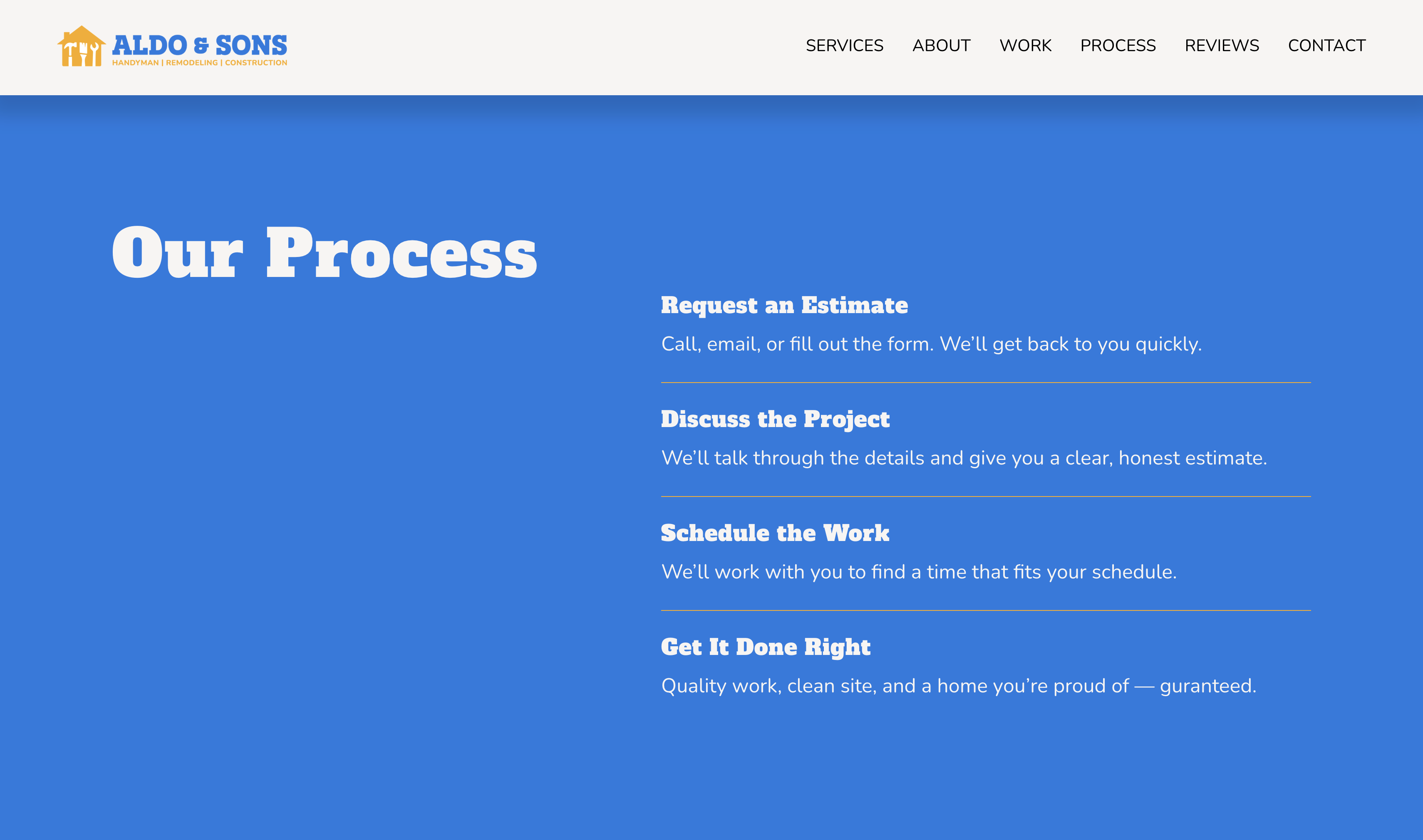
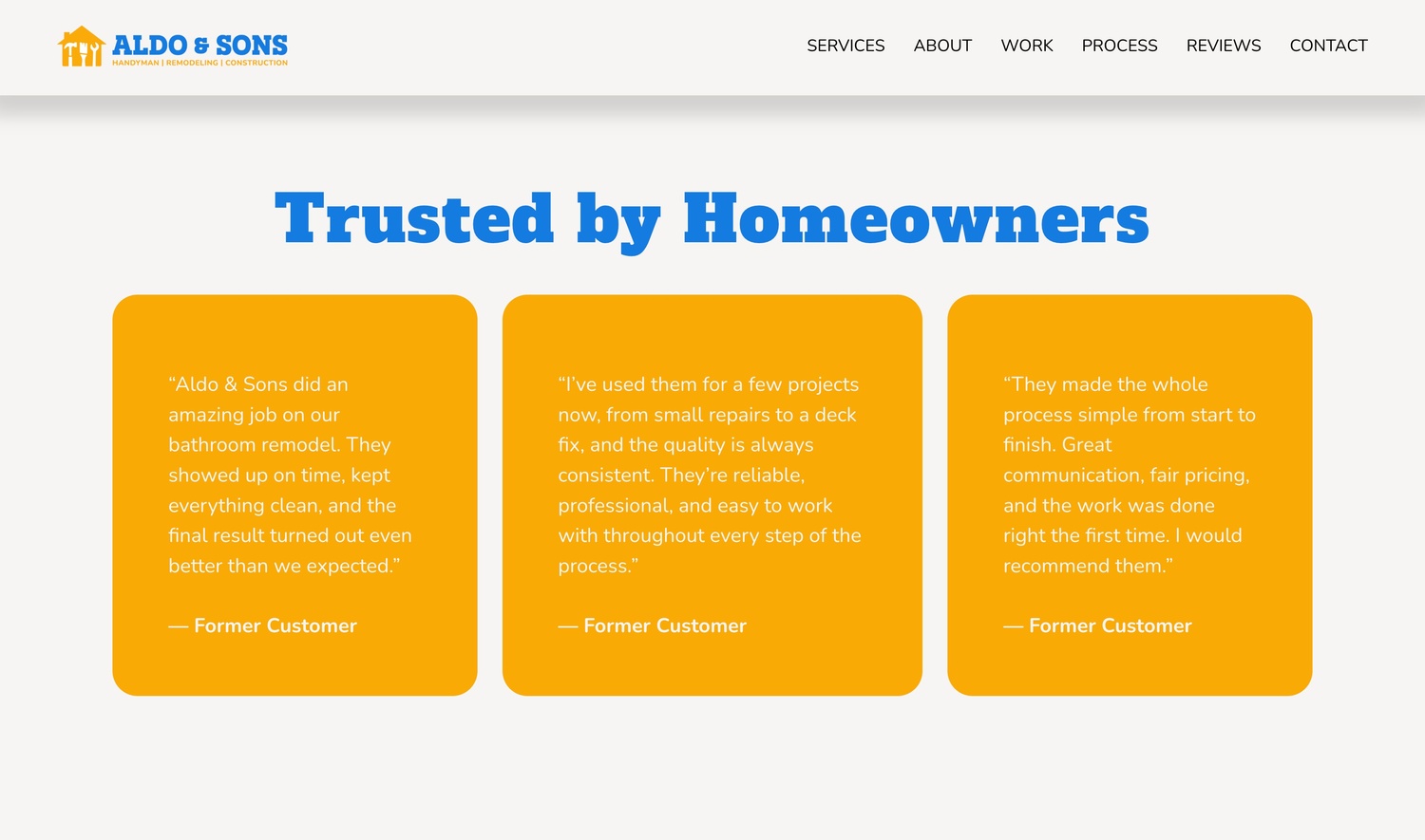
The website was designed as a responsive one-page scrolling experience that builds trust, organizes services clearly, and creates a smoother path from first interaction to estimate request. Since the company previously relied heavily on referrals, the website became an important tool for establishing credibility and centralizing information online.
The design focused on clear navigation, strong calls-to-action, project galleries, testimonials, and a clean structure that reflects professionalism and attention to detail.

The identity system was extended across multiple branded applications to create consistency across both digital and physical touchpoints. Applications included social media templates, business cards, and branded workwear, helping reinforce a cohesive and recognizable brand presence across each interaction.
Each piece was designed to reflect the same core brand qualities: professionalism, reliability, and clear communication.
The final result is a cohesive branding and web design system that gives Aldo & Sons a stronger and more professional presence across both online and physical platforms. The project successfully translated the company’s reputation for quality craftsmanship and reliability into a recognizable visual identity and user experience.
The new system helps communicate services more clearly, strengthen customer trust, and provide a scalable foundation for future growth.
This project strengthened my understanding of how branding and web design work together to shape trust and perception for local businesses. I learned the importance of building systems that stay consistent across multiple applications rather than designing isolated pieces.
It also reinforced how thoughtful structure, clear communication, and cohesive visuals can help smaller businesses feel more established and professional.